
Beyond the Swatch: 5 Surprising Truths About Your Home’s Next Color Palette
The Swatch Paradox
Homeowners today are frequently caught in the "Swatch Paradox." You stand before a sea of greige and near-identical white chips. You feel paralyzed by choice yet completely uninspired by the expected results. While many treat paint as a simple aesthetic overlay, 2026 brings a massive shift. This is the year where emotional resonance finally meets indoor ecology. Finding your ideal home color palette is crucial.
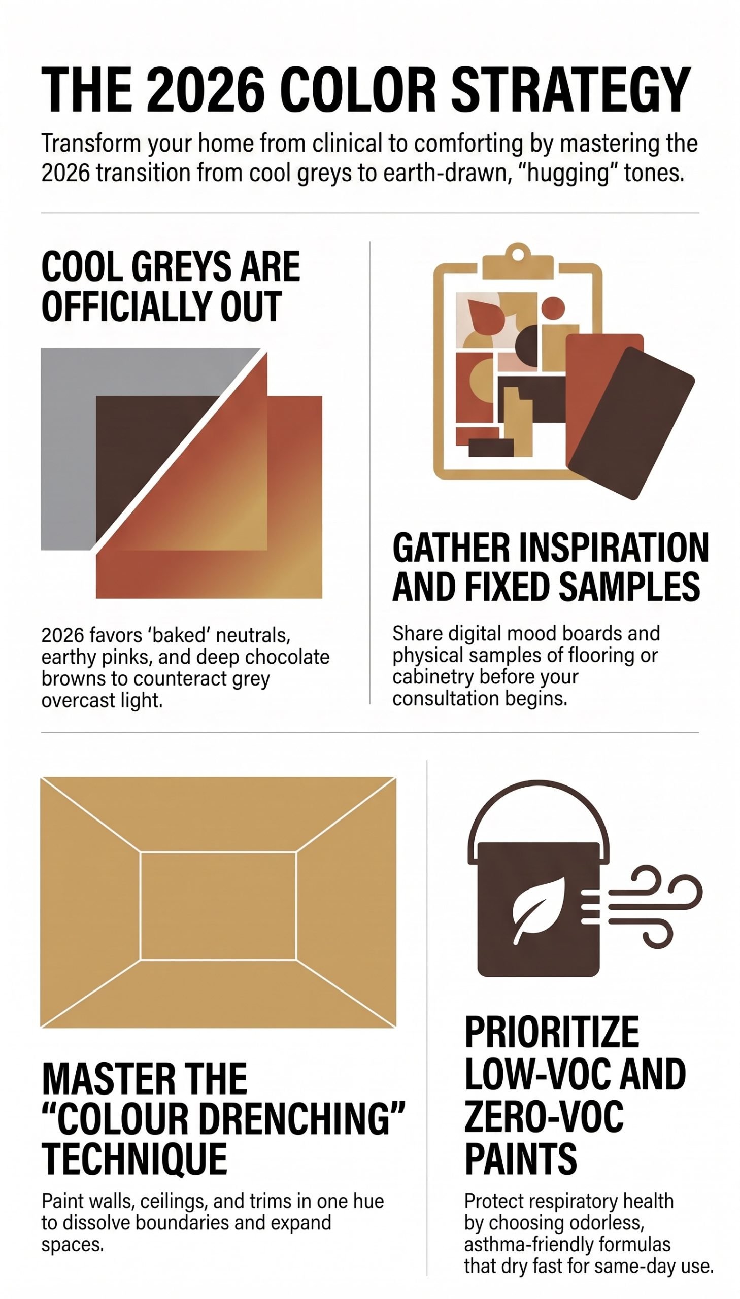
Color selection is no longer just a superficial trend-following exercise. It is a meticulous blend of environmental science, cognitive psychology, and health. The following insights move beyond the predictable, tired formulas of the past decade.
They reveal how your home can safely transition from a clinical showroom into a true sanctuary. We must prioritize holistic well-being and immersive design over fleeting fads. Designing your new home color palette requires deep intentionality.
Why The Gray Era Is Officially Over (And Brown Is The New Black)
The long-standing dominance of cool, clinical grays has officially reached its expiration date. Homeowners are tired of sterile environments that lack personality. As we move deeply into 2026, the standard for residential luxury is shifting aggressively. We are moving toward "baked" neutrals, muddy greens, and deep, nostalgic browns.
Concept Definition: Baked Neutrals
Unlike flat grays or stark whites, baked neutrals contain warm, earthy undertones. They mimic natural elements like clay, soil, and stone. They actively absorb light to create a cozy, grounded atmosphere.
This massive transition is best exemplified by the highly anticipated Dulux 2026 Forecast Palettes. These collections completely redefine what a modern home color palette should look and feel like. They focus heavily on warmth, tactile energy, and emotional security.
| Dulux 2026 Palette | Core Concept | Key Hero Colors |
|---|---|---|
| Evoke | A celebration of maximalism and character. | Earthy pinks (Baked Clay), dramatic tones (Chocolate Treat). |
| Elemental | A grounded, highly tonal collection. | Warm neutrals (Caramel Sundae, Coffee Dust). |
| Ethereal | Delicate hues designed to evoke total serenity. | Gentle greens, romantic pastels (Tiamo). |
In this bold new era, Brown has undeniably become the "New Black." Stark black often absorbs too much light and creates a cold, heavy atmosphere. Conversely, deep espresso and rich chocolate tones provide incredible architectural drama. Colors like Benjamin Moore’s Silhouette offer a richness that standard black entirely lacks.
We are also seeing a rapid rise in "muddy" greens. Taubmans "Team Spirit" is a perfect example. It offers a grounded, nature-inspired strength. It serves as a highly stable backdrop against Melbourne's famously shifting weather patterns. Our interior painting services frequently utilize these earthy greens to bridge indoor and outdoor spaces beautifully.
The Illusory Magic Of Color Drenching In Modern Homes
One of the most transformative design techniques of the decade is "Color Drenching." This powerful strategy involves painting walls, ceilings, skirtings, doors, and trims in the exact same hue. It completely reimagines how we perceive the geometry of a room.
Key Tip: Eliminating Boundaries
By eliminating the traditional white ceiling and contrasting trim, you successfully dissolve the hard visual boundaries. This prevents the brain from easily defining a room's physical limits.
For smaller Melbourne apartments, this technique is an absolute masterstroke. It creates an expansive, seamless environment rather than a claustrophobic one. The eye naturally glides upward without interruption.
Crucial Warning: Surface Preparation
As a strategist, I must emphasize a critical caveat. The success of color drenching rests entirely on surface preparation. Dark colors aggressively reveal every flaw, bump, and drywall seam. Therefore, premium plastering and flawless prep are absolutely non-negotiable. This ensures the finish looks sophisticated rather than patchy and amateurish.
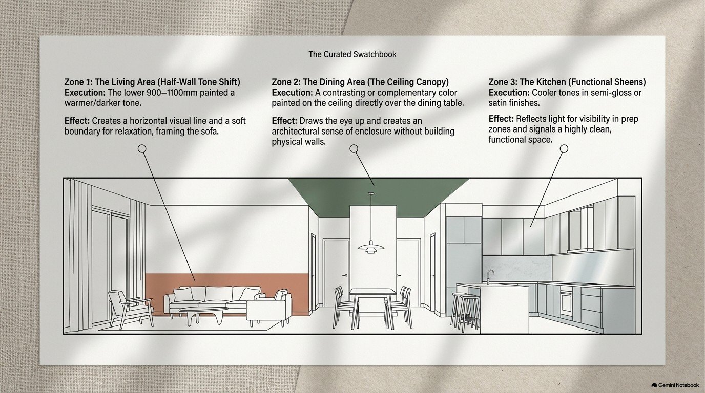
To maintain architectural interest within a heavily drenched space, you must vary your sheen levels. Using the exact same finish everywhere makes a room look plastic. Instead, deploy a strategic mix of glosses to manipulate natural light beautifully.
✓ The Step-by-Step Sheen Strategy
Matte Finish for Ceilings
Use matte exclusively on ceilings. This hides structural imperfections and creates a soft, non-reflective canopy overhead.
Low Sheen for Walls
Apply a low sheen finish to walls. It provides a highly durable, washable surface that beautifully retains color depth without glare.
Semi-Gloss for Trims
Reserve semi-gloss paints for wooden trims, architraves, and doors. It catches ambient light and highlights the home's architectural craft.
Mid-Article Summary: The Visual Shift
We are abandoning high-contrast white trims and sterile grays. Embracing earthy browns, baked greens, and unified color drenching techniques creates homes that feel emotionally secure, expansive, and deeply rooted in modern design.
Why Your Paint Choice Is A Health Mandate, Not Just Style
Indoor air quality has rapidly become a cornerstone of modern residential design strategy. Aesthetics are important, but biology cannot be ignored. We are spending more time indoors than any previous generation.
Of toxins absorbed by the human body originate from indoor air.
With this staggering research in mind, your choice of home color palette is a strict health mandate. Traditional paints consistently release Volatile Organic Compounds (VOCs). These dangerous chemicals can cause severe respiratory issues long after the "new paint smell" has entirely faded.
Modern Low-VOC and Zero-VOC formulas are now the absolute standard for the 2026 family home. These advanced paints are virtually odorless. They dry incredibly rapidly, meaning residents can typically sleep in the newly painted room the exact same day. If you are planning a kitchen renovation, demanding low-toxicity finishes around food preparation areas is vital.
Health-Focused Application Checklist
- ☑ Verify that the chosen paint explicitly states "Zero-VOC" on the label.
- ☑ Ensure all primers and undercoats used match the low-toxicity standard.
- ☑ Confirm antimicrobial properties if painting wet areas like bathrooms.
| Premium Health-Focused Standard | Core Technological Benefit |
|---|---|
| Taubmans Pure Performance | Engineered with Microban® antibacterial protection to inhibit mold and mildew. It is a hero of the National Asthma Council Australia’s Sensitive Choice program. |
| Haymes Ultra Premium | A family-owned Australian favorite known globally for its strict Zero-VOC content and high-durability finish supporting long-term air health. |
The Melbourne Paradox: Why Experts Ignore Photo Inspiration
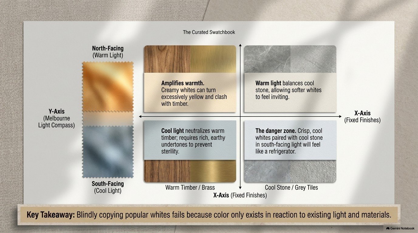
Digital inspiration is a wonderful starting point for your home color palette. However, a true professional will never finalize a palette purely from a screen. This caution is primarily due to what industry experts call "The Melbourne Paradox."
Definition: The Melbourne Paradox
A phenomenon where a crisp white like Lexicon Quarter looks luminous in a north-facing Brighton home with large windows, but that exact same color appears horribly cooler and flatter in a shaded Carlton terrace surrounded by neighboring greenery. Geographic lighting completely alters paint chemistry.
To ensure your consultation yields the perfectly tailored colors the very first time, homeowners must avoid rushing. You must complete three critical preparation tasks before opening a single tin of paint.
3 Critical Preparation Tasks Checklist
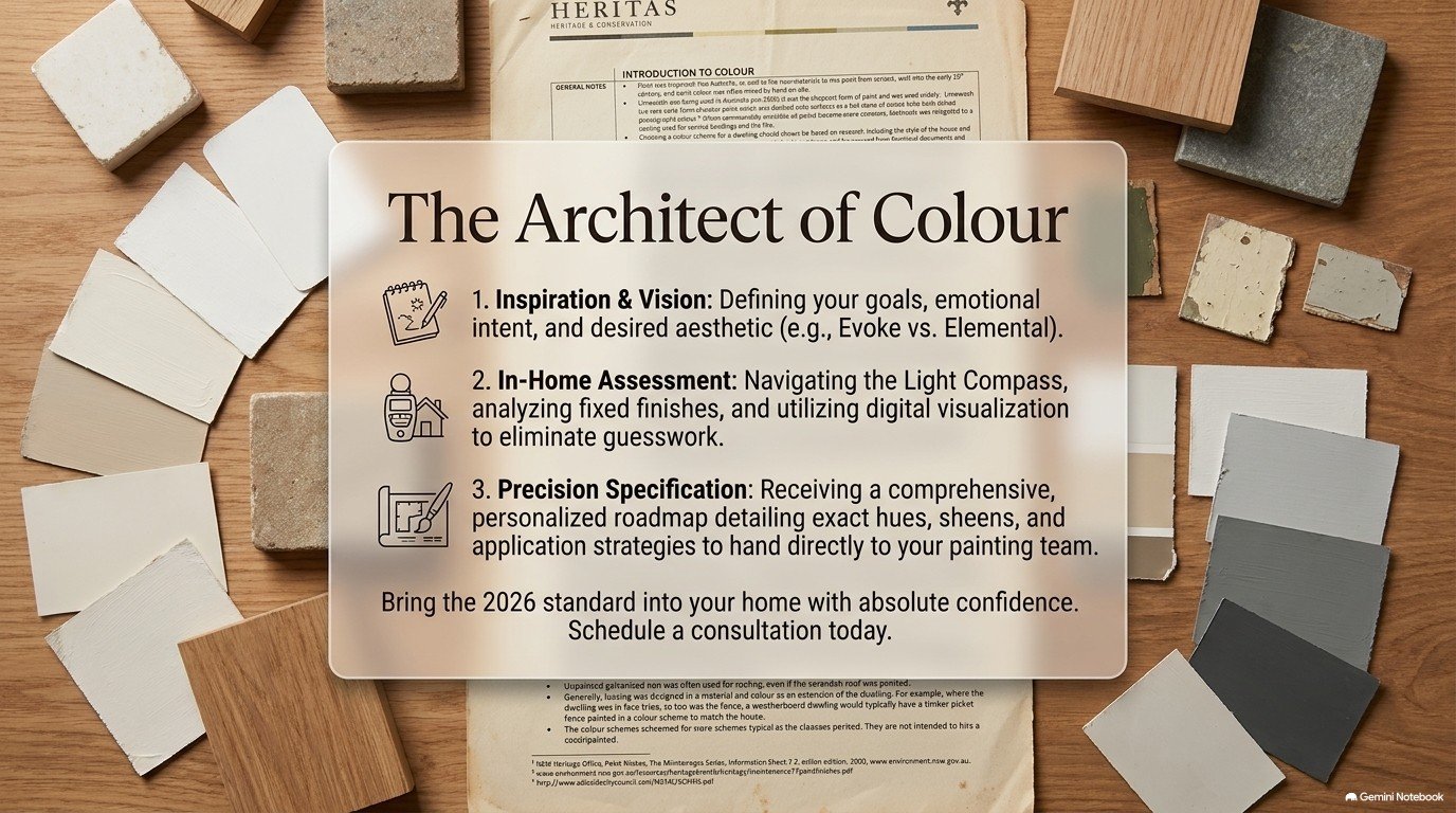
- 1. Define the Vision: Gather inspiration images not to copy them blindly, but to help your consultant identify the underlying "dream home" vision and emotional goals.
- 2. Audit Fixed Finishes: Gather physical samples of your flooring, cabinetry, and stone benchtops. The new paint must seamlessly harmonize with these expensive, permanent elements.
- 3. Trust the Knowledge: Keep a completely open mind. A strategist may suggest a tone that looks "muddy" on a swatch but will look absolutely perfect under your specific architectural shading.
Zoning Strategies: Defining Space Without Building Walls
In the sprawling open-plan layouts that heavily dominate Australian architecture, defining individual rooms can be difficult. Paint serves as the primary, cost-effective tool for clever "zoning." It creates clear functional boundaries without constructing physical barriers.
By aggressively utilizing tone shifts and subtle contrast, we can firmly anchor a space. A wildly powerful but criminally underused tool here is using the Ceiling as a Zoning Tool. This is a favorite technique among premium designers.
Key Tip: The Visual Canopy Effect
By painting the ceiling directly above a dining table in a rich, complementary hue, you instantly create a "visual canopy effect." This provides an architectural sense of enclosure and intimacy within a much larger, echoing room.
However, remember that restraint is a very deliberate design decision. Zoning is powerful, but overusing it destroys a home's flow. Your home color palette needs logic.
Warning: Avoid Visual Chaos
To successfully avoid overwhelming visual chaos, you must limit your paint zoning. Stick strictly to no more than three distinct thematic areas per main open-plan room (for example: cooking, eating, and relaxing).
Mid-Article Summary: Precision and Planning
Creating a breathtaking home color palette isn't about picking a random swatch. It requires auditing fixed finishes, adapting to local geographic light, and using color mathematically to zone large open-plan spaces without building structural walls.
The Sanctuary Standard for 2026 and Beyond
As we look firmly toward the 2026 horizon, the foundational standard for the Australian home has beautifully evolved. It is no longer a shallow question of "Is this trendy?" The primary question is now "Is this space layered, healthy, and emotionally immersive?"
The massive transition toward earth-drawn tones and color-drenched environments reflects a deep collective need. We desperately require a home that acts as a secure, grounding force against the chaos of modern life. A perfect home color palette achieves exactly this.
Your walls are significantly more than just structural boundaries holding up a roof. They are the absolute foundation of your daily physical health and your emotional well-being. Ask yourself honestly: does your current palette provide a warm, tactile embrace, or is it merely a predictable, sterile formula?
Key Tip: The First Step
Investing intelligently in an intentional, health-conscious palette is always the very first step. It is the most impactful method for turning a standard residence into a true, restorative sanctuary. Don't leave it to chance.
When executing these advanced techniques, partnering with seasoned professionals ensures flawless prep and execution. Whether it is selecting zero-VOC formulas or applying the perfect sheen strategy, precision matters.
Transform Your Home With Renova Co
Ready to leave the Swatch Paradox behind? Renova Co specializes in high-quality professional home painting across Melbourne. We guarantee premium finishes, flawless prep work, and a commitment to your home's health using advanced materials.
Hours: Mon–Sat, 8am–6pm | Location: 65 Maple Crescent, Hoppers Crossing